Harmony (color)
In color theory, color harmony refers to the property that certain aesthetically pleasing color combinations have. These combinations create pleasing contrasts and consonances that are said to be harmonious. These combinations can be of complementary colors, split-complementary colors, color triads, or analogous colors. Color harmony has been a topic of extensive study throughout history, but only since the Renaissance and the Scientific Revolution has it seen extensive codification. Artists and designers make use of these harmonies in order to achieve certain moods or aesthetics.
Types
[edit]


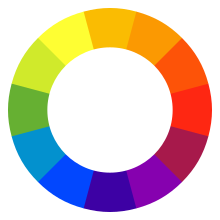
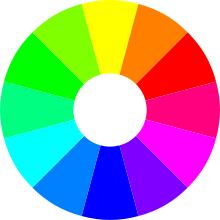
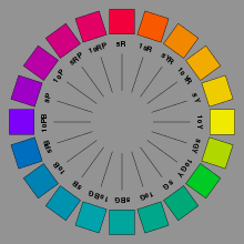
Several patterns have been suggested for predicting which sets of colors will be perceived as harmonious. One difficulty with codifying such patterns is the variety of color spaces and color models that have been developed. Different models yield different pairs of complementary colors and so forth, and the degree of harmony of sets derived from each color space is largely subjective. Despite the development of color models based on the physics of color production, such as RGB and CMY, and those based on human perception, such as Munsell and CIE L*a*b*, the traditional RYB color model (common to most early attempts at codifying color) has persisted among many artists and designers for selecting harmonious colors.
Complementary colors
[edit]Complementary colors exist opposite each other on the color wheel. They create the most contrast and therefore greatest visual tension by virtue of how dissimilar they are.
Split-complementary colors
[edit]Split-complementary colors are like complementary colors, except one of the complements is split into two nearby analogous colors. This maintains the tension of complementary colors while simultaneously introducing more visual interest with more variety.
Color polygons
[edit]Triads
[edit]Similarly to split-complementary colors mentioned above, color triads involve three colors in a geometric relationship. Unlike split-complementary colors, however, all three colors are equidistant to one another on the color wheel in an equilateral triangle. The most common triads are the primary colors. From these primary colors are obtained the secondary colors.
Analogous colors
[edit]The simplest and most stable harmony is that of analogous colors. It is composed of a root color and two or more nearby colors. It forms the basis for a color scheme, and in practice many color schemes are a combination of analogous and complementary harmonies in order to achieve both visual interest through variety, chromatic stability, and tension through contrast.
Relationship
[edit]It has been suggested that "Colors seen together to produce a pleasing affective response are said to be in harmony".[1] However, color harmony is a complex notion because human responses to color are both affective and cognitive, involving emotional response and judgement. Hence, our responses to color and the notion of color harmony is open to the influence of a range of different factors. These factors include individual differences (such as age, gender, personal preference, affective state, etc.) as well as cultural, sub-cultural and socially-based differences which gives rise to conditioning and learned responses about color. In addition, context always has an influence on responses about color and the notion of color harmony, and this concept is also influenced by temporal factors (such as changing trends) and perceptual factors (such as simultaneous contrast) which may impinge on human response to color. The following conceptual model illustrates this 21st century approach to color harmony:
Wherein color harmony is a function (f) of the interaction between color/s (Col 1, 2, 3, …, n) and the factors that influence positive aesthetic response to color: individual differences (ID) such as age, gender, personality and affective state; cultural experiences (CE); contextual effects (CX) which include setting and ambient lighting; intervening perceptual effects (P); and temporal effects (T) in terms of prevailing social trends.[2]
In addition, given that humans can perceive over 2.8 million different colors,[3] it has been suggested that the number of possible color combinations is virtually infinite thereby implying that predictive color harmony formulae are fundamentally unsound.[4] Despite this, many color theorists have devised formulae, principles or guidelines for color combination with the aim being to predict or specify positive aesthetic response or "color harmony". Color wheel models have often been used as a basis for color combination principles or guidelines and for defining relationships between colors. Some theorists and artists believe juxtapositions of complementary color will produce strong contrast, a sense of visual tension as well as "color harmony"; while others believe juxtapositions of analogous colors will elicit positive aesthetic response. Color combination guidelines suggest that colors next to each other on the color wheel model (analogous colors) tend to produce a single-hued or monochromatic color experience and some theorists also refer to these as "simple harmonies". In addition, split complementary color schemes usually depict a modified complementary pair, with instead of the "true" second color being chosen, a range of analogous hues around it are chosen, i.e. the split complements of red are blue-green and yellow-green. A triadic color scheme adopts any three colors approximately equidistant around a color wheel model. Feisner and Mahnke are among a number of authors who provide color combination guidelines in greater detail.[5][6]
Color combination formulae and principles may provide some guidance but have limited practical application. This is because of the influence of contextual, perceptual and temporal factors which will influence how color/s are perceived in any given situation, setting or context. Such formulae and principles may be useful in fashion, interior and graphic design, but much depends on the tastes, lifestyle and cultural norms of the viewer or consumer.
As early as the ancient Greek philosophers, many theorists have devised color associations and linked particular connotative meanings to specific colors. However, connotative color associations and color symbolism tends to be culture-bound and may also vary across different contexts and circumstances. For example, red has many different connotative and symbolic meanings from exciting, arousing, sensual, romantic and feminine; to a symbol of good luck; and also acts as a signal of danger. Such color associations tend to be learned and do not necessarily hold irrespective of individual and cultural differences or contextual, temporal or perceptual factors.[7] It is important to note that while color symbolism and color associations exist, their existence does not provide evidential support for color psychology or claims that color has therapeutic properties.[8]
See also
[edit]References
[edit]- ^ Burchett, K. E. (2002). Color harmony. Color Research and Application, 27 (1), pp28-31.
- ^ O'Connor, Z. (2010). Color harmony revisited. Color Research and Application, 35 (4), pp267-273.
- ^ Pointer, M. R. & Attridge, G.G. (1998). The number of discernible colors. Color Research and Application, 23 (1), pp52-54.
- ^ Hard, A. & Sivik, L. (2001). A theory of colors in combination - A descriptive model related to the NCS color-order system. Color Research and Application, 26 (1), pp4-28.
- ^ Feisner, E. A. (2000). Colour: How to use colour in art and design. London: Laurence King.
- ^ Mahnke, F. (1996). Color, environment and human response. New York: John Wiley & Sons.
- ^ Bellantoni, Patti (2005). If it's Purple, Someone's Gonna Die. Elsevier, Focal Press. ISBN 0-240-80688-3.
- ^ O'Connor, Z. (2010). Colour psychology and colour therapy: Caveat emptor. Color Research and Application, (Published online in 'EarlyView' in advance of print).

