Wikipedia:Featured picture candidates/Hippo skull dark.jpg
Appearance


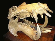
A sharp and truely striking picture that does a great job of illustrating skull and hippopotamus
- Nominate and support. - Circeus 21:09, July 13, 2005 (UTC)
- (As the author of the picture) Support. →Raul654 21:21, July 13, 2005 (UTC)
- Neutral. Mildly distracting background and shadows. Might benefit from a tighter crop on the top and left to center the skull. —Cryptic (talk) 22:52, 13 July 2005 (UTC)
Oppose the darkened version - edit lines are visible along the top edge of the box. —Cryptic (talk) 20:58, 30 July 2005 (UTC)- Prefer the new improved darker version, but still neutral overall due to the shadows on the box. (Hard to please, aren't I?) —Cryptic (talk) 08:19, 31 July 2005 (UTC)
- I was going to say - now does anyone want to try their hand at revarnishing the box... ;-) -- Solipsist 09:47, 31 July 2005 (UTC)
- Prefer the new improved darker version, but still neutral overall due to the shadows on the box. (Hard to please, aren't I?) —Cryptic (talk) 08:19, 31 July 2005 (UTC)
- Not a vote, but I agree with Crptic about the background. I think that photoshopping this to make everything black except the wooden thing it's resting on would probably improve this image. Lupin 02:24, 14 July 2005 (UTC)
- Oppose. Background is a problem. Enochlau 03:22, 16 July 2005 (UTC)
- Support. Image is very good quality and when you view it full you can see every detail which in my opinion would make it a good candiate. • Thorpe • 11:53, 16 July 2005 (UTC)
- Support - Good quality, high-res pic. background is only a minor flaw -- Chris 73 Talk 16:39, July 16, 2005 (UTC)
- Support --ZeWrestlerTalk 21:30, 19 July 2005 (UTC)
- Slight support, but it does seem quite suitable for Halloween. :) — Stevey7788 (talk) 20:59, 20 July 2005 (UTC)
- Neutral. Hard to decide. Its an interesting subject and an excellent addition to the article. I particularly like the wear on the tusks (I seem to recall that tooth wear is one of principle causes of death for wild hippos, but I can't find a reference and as they are herbivores it would probably be problems with the back molars that is the issue.) My only problem is the unflattering flash lighting (which was probably necessary) and to a lesser extent the background. -- Solipsist 08:10, 26 July 2005 (UTC)
- Oppose. Not particularly striking. Background issues. --ScottyBoy900Q∞ 20:49, 27 July 2005 (UTC)
- Support version with darkened background. Sango123 20:32, July 30, 2005 (UTC)
- Support. Version with darkened background. I'd like the far end of the table to be more shadowed rather than just suddenly hit a black background with no gradient into it but the current one is striking. - Whitehorse1 02:13, 31 July 2005
- Comment: I think the darkened background is a good idea. I've just uploaded a version with a slightly neater job of masking the background, and also applied Whitehorse1's idea of de-emphasising the bottom left corner of the table. -- Solipsist 07:48, 31 July 2005 (UTC)
Promoted Image:Hippo skull dark.jpg +8 / -3 / 2 Neutral - most objections relate to the background, so promoting version with darkend background. -- Solipsist 20:19, 3 August 2005 (UTC)
