Wikipedia:Featured picture candidates/William Tecumseh Sherman
Appearance


- Reason
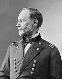
- Good scan of good 19th century portrait
- Articles this image appears in
- William Tecumseh Sherman, a few others
- Creator
- Mathew Brady
- Support as nominator — Spikebrennan 21:58, 2 July 2007 (UTC)
- Support - One or two bits blurry, but for a historical image, superb. So long as it's no worse in that respect than the original, I give it my wholehearted support. Adam Cuerden talk 23:35, 2 July 2007 (UTC)
Support- It's amazing how long good photography's been around. --TotoBaggins 23:59, 2 July 2007 (UTC)- Support the above reasons. TomStar81 (Talk) 07:17, 3 July 2007 (UTC)
- Support Alternative
Maybe I'd be inclined to support it if it was the only photo of him available, butmy opinion is that this image is much superior because it really illustrates his "seamed weather-beaten face, unkempt hair and scraggly red beard."[1] Cacophony 07:32, 3 July 2007 (UTC)
- I considered nominating the one that Cacophony references--that image certainly does simultaneously convey a mood of weariness and arrogant defiance, and it's a great image-- but I found the darkness of the corners of that image to be distracting. Spikebrennan 13:10, 3 July 2007 (UTC)
- Support alternative - I'm sure this breaks some element of FPC protocol, but I *love* that image Caco posted, so I'm offering it as an alternative. While the original's composition is better, the alternative is just so humanizing; he looks like a rough bastard I might run into at the Kwik-E-Mart today, and whom I wouldn't want to get on the wrong side of. This one is great too, but a bit small and blown-out. --TotoBaggins 16:04, 3 July 2007 (UTC)
- Votes in favor of the alternative won't work unless somebody goes through the protocol of nominating it. (Nothing stopping you from doing so). Spikebrennan 18:42, 3 July 2007 (UTC)
- I don't think there is any thing wrong with alts getting votes - happens all the time. Debivort 01:00, 4 July 2007 (UTC)
- support either Debivort 01:00, 4 July 2007 (UTC)
- Oppose. The second one is a far better portrait - there's more than just lighting and angles to a photo, and it really captures something, as TotoBaggins says above. But the crop is a little weird and the vignetting in the bottom right is off-putting. The first one is just bland, only shows half of his face, and feels PR-ish, like someone's trying to artificially make Sherman seem grandfather-ish. zafiroblue05 | Talk 00:08, 6 July 2007 (UTC)
Promoted Image:Tecumseh sherman.jpg MER-C 02:18, 9 July 2007 (UTC)
