Wikipedia:Graphics Lab/Illustration workshop/Archive/Jan 2024
Appearance
  | This page, part of the Graphics Lab Wikiproject, is an archive of requests for 2024. Please do not edit the contents of this page. You can submit new requests here. |
 | Archives of 2024: January, February, March, April, May, June, July, August, September, October, November, December |
Proposed flags of the North Riding of Yorkshire (2013)
{{resolved}}
-
The current flag of the NROY, which was "Design D" in the 2013 competition. The rose can be used as a template in the creation of all of the flags in this request.
-
The Cross of Saint George, which can be used for two of the flags in this request.
-
Design A
-
Design B
-
Design C
-
Design E
-
Design F
- Article(s)
- Flags and symbols of Yorkshire
- Request
- Would someone please create SVG files of the other five finalists ("Design A", "Design B", "Design C", "Design E" and "Design F") from the 2013 competition organised to design an official flag for the North Riding of Yorkshire. Thanks. Snow Lion Fenian (talk) 15:57, 29 December 2023 (UTC)
- Discussion
@Snow Lion Fenian: ![]() Request taken by Sriveenkat (talk) 21:21, 24 January 2024 (UTC).
Request taken by Sriveenkat (talk) 21:21, 24 January 2024 (UTC).
- @Snow Lion Fenian:
 Done Sriveenkat (talk) 01:28, 25 January 2024 (UTC)
- @Sriveenkat: Thank you very much for creating these flags! Amazing job as always. Just one last thing before I close this request... is there any chance the positions of the roses on "Design A" could be altered, so that the middle rose is at the exact centre of the cross (it appears to be slightly upper-left of centre on the current version of the file), and that the length of distance between all three roses remains the same? Sorry for the inconvenience. Snow Lion Fenian (talk) 01:04, 26 January 2024 (UTC)
- @Snow Lion Fenian Fixed middle rose is at the exact centre of the cross. "That the length of distance between all three roses remains the same?" Yes, I aligned length of distance between using Inkscape's Align tool. Please verify looks fine. Thank you :) Sriveenkat (talk) 13:27, 26 January 2024 (UTC)
- @Sriveenkat: Yes, that's fine, and thanks as per usual for all the time and work you put into this request. Greatly appreciated! Snow Lion Fenian (talk) 15:12, 26 January 2024 (UTC)
- @Snow Lion Fenian Fixed middle rose is at the exact centre of the cross. "That the length of distance between all three roses remains the same?" Yes, I aligned length of distance between using Inkscape's Align tool. Please verify looks fine. Thank you :) Sriveenkat (talk) 13:27, 26 January 2024 (UTC)
- @Sriveenkat: Thank you very much for creating these flags! Amazing job as always. Just one last thing before I close this request... is there any chance the positions of the roses on "Design A" could be altered, so that the middle rose is at the exact centre of the cross (it appears to be slightly upper-left of centre on the current version of the file), and that the length of distance between all three roses remains the same? Sorry for the inconvenience. Snow Lion Fenian (talk) 01:04, 26 January 2024 (UTC)
Proposed flags of the Isle of Wight (2008)
{{resolved}}
-
 Done
Done -
 Done
Done -
The current flag of the IOW, which was "Design 4" in the 2008 contest. The diamond with the indentation at the top can be used in the creation of "Design 1".
- Article(s)
- Flag of the Isle of Wight
- Request
- Can someone please create SVG files for the other three finalists ("Design 1", "Design 2" and "Design 3") from the 2008 competition set up to design an official flag for the Isle of Wight, as seen here. Thanks. Snow Lion Fenian (talk) 00:03, 3 January 2024 (UTC)
- Discussion
 Request taken by QuickQuokka. for designs 1 and 2. QuickQuokka [talk • contribs] 17:43, 4 January 2024 (UTC)
 One done, one (or two if I' have enough energy) to go QuickQuokka [talk • contribs] 18:08, 4 January 2024 (UTC)
 Design 2 done --QuickQuokka [talk • contribs] 18:26, 4 January 2024 (UTC)
- @QuickQuokka: Great job! Thank you for doing those two. Snow Lion Fenian (talk) 20:57, 5 January 2024 (UTC)
- @Snow Lion Fenian Design 3 is
 Done Sriveenkat (talk) 10:16, 26 January 2024 (UTC)
- @Sriveenkat: Thank you for finishing this request! Snow Lion Fenian (talk) 10:21, 26 January 2024 (UTC)
- @Snow Lion Fenian Design 3 is
- @QuickQuokka: Great job! Thank you for doing those two. Snow Lion Fenian (talk) 20:57, 5 January 2024 (UTC)
Near-Earth asteroid orbital classes
-
Types of near-Earth asteroid orbits
-
General location of Atira group asteroids
-
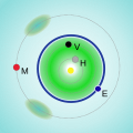
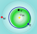
General location of Aten group asteroids
-
General location of Apollo group asteroids
-
General location of Amor group asteroids
- Article(s)
- Near-Earth object
- Request
- I request a new SVG diagram showing examples for the four orbital classes of near-Earth asteroids, because the existing images are all very problematic, and both their original creators and previous editors who worked on them are gone (and I lack SVG skills):
- The first image is cluttered with over-lapping orbits, lacks an Atira orbit, and the thin lines on black background have poor visibility.
- The other diagrams seem to show the distribution of several of these objects, but there is no source for actual scientific data and the distributions are wrong for all four of them (I can go into detail if you're interested), in fact for Apollos and Amors they give the wrong impression.
- Two of the "general location" diagrams also have unnecessary elements in them (Martian Trojans).
My idea is to replace these five with a single diagram, one showing example orbits for all classes like the first, but uncluttered and with the visuals of the other four. I would propose the following:
- The Aten diagram is a good start (it has a light background and shows the orbits of the four inner planets to scale, and has Earth's orbit emphasized). Remove the dots & letters, and replace the green stuff with its outline (the outer ellipse): that would be a good Aten example orbit.
- For the Atiras, using another colour, add another ellipse so that it is halfway between the Aten example orbit & Venus's orbit on the top left and close to Earth's orbit from the inside on the bottom right.
- For the Apollos, using yet another colour, add another ellipse in a way that it cuts a bit into Earth's orbit on the top left and is outside the Aten example orbit at bottom right.
- For the Amors, using yet another colour, add another ellipse that contains the entirety of both Earth's orbit and the Apollo example orbit, but comes close to Earth's orbit on the top left. (If there is space, or it's not too much trouble to increase the image's edges a bit, it's best if it even crosses Mars's orbit.)
- Add a legend or mark the orbits in some other way.
I hope this would not be too much work & can be made to look not too cluttered & comprehensible even at 200px wide. But I am of course open to suggestions as to how the goal of providing comprehensible illustrations can be done differently. Or to questions if you're not familiar enough with the subject and/or I wasn't clear enough.
-- Rontombontom (talk) 16:56, 27 January 2024 (UTC)
- Discussion
- Here is how NASA does it: NEO Basics These images would also be in the public domain, so we could upload and use them right away... Renerpho (talk) 17:06, 28 January 2024 (UTC)
- User Renerpho beat you to it and already inserted that image. It's perfect. Rontombontom (talk) 17:16, 28 January 2024 (UTC)
- {{resolved}}


